
Brand Development
I create brand identities for a wide range of clients across diverse industries, developing cohesive visual systems that capture the essence of each business. My approach combines strategic thinking with creative execution, delivering clear, impactful designs that not only stand out visually but also support long-term brand growth. From initial concept through to full brand rollout, every element is crafted to strengthen the business’s presence and connect meaningfully with its audience.
Nicholas Meloni
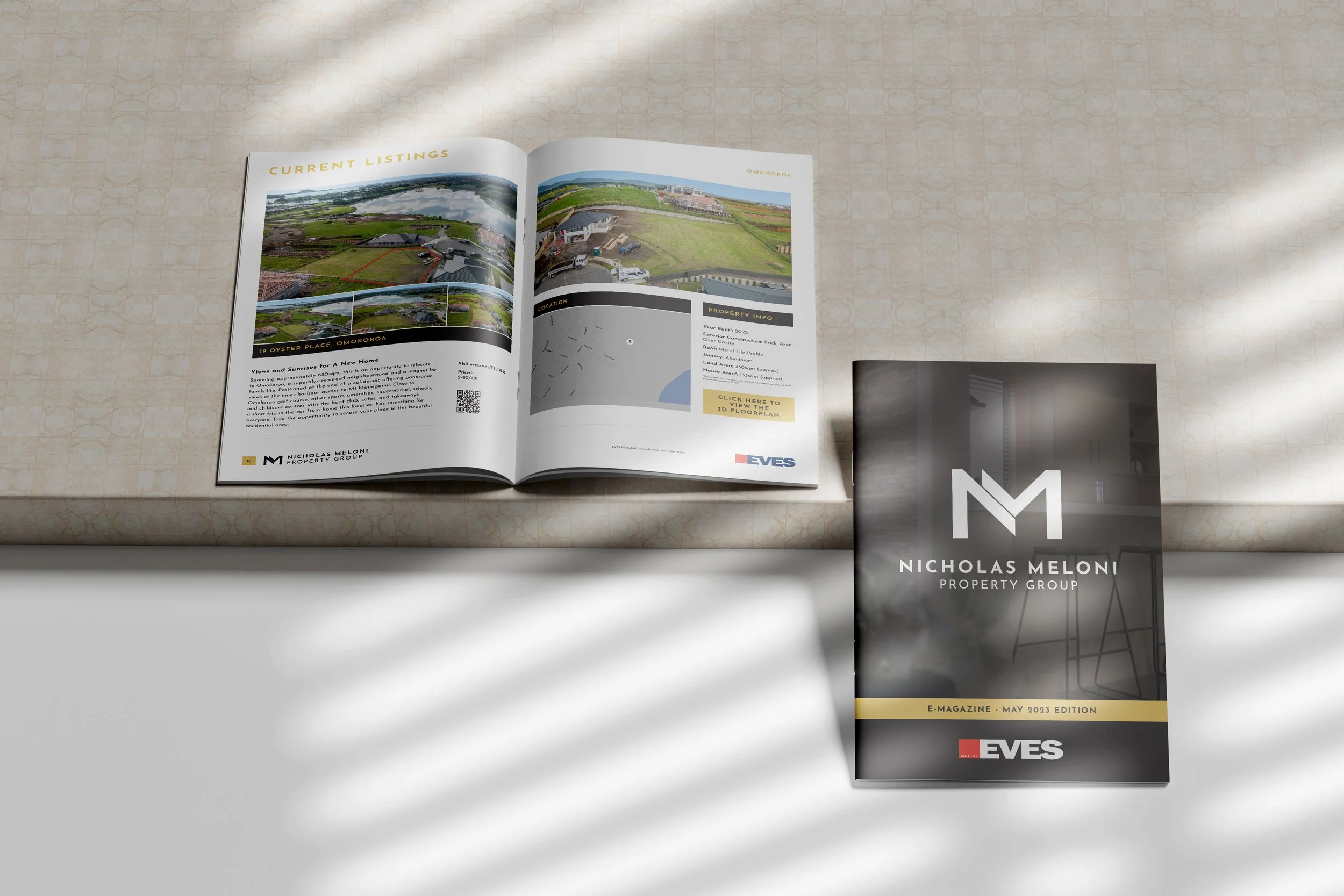
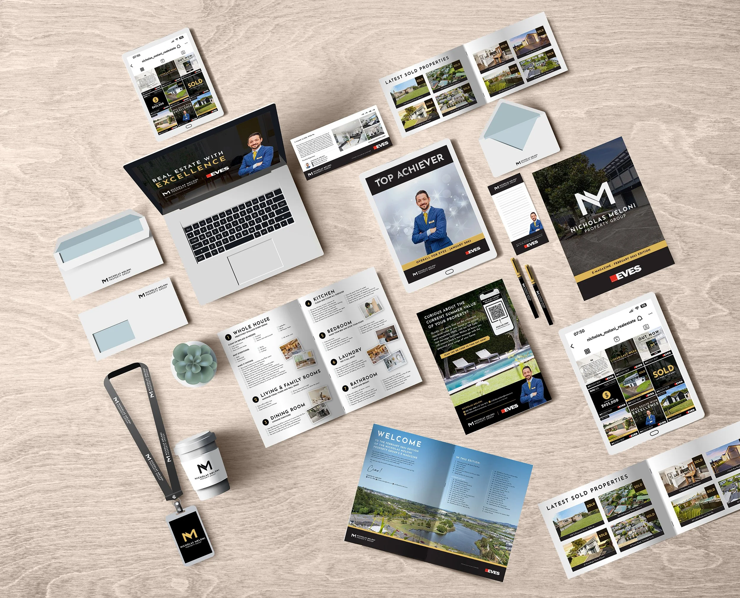
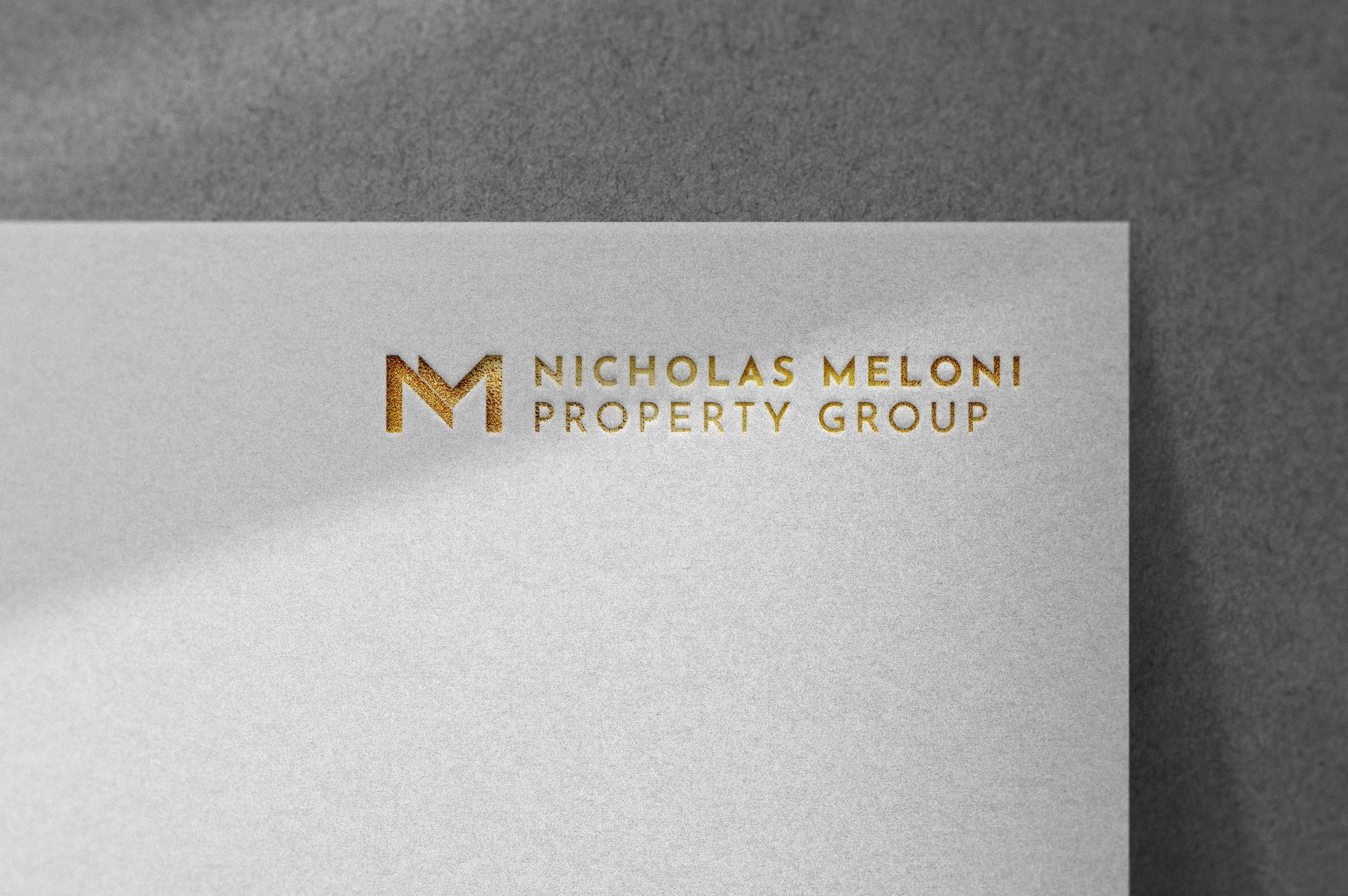
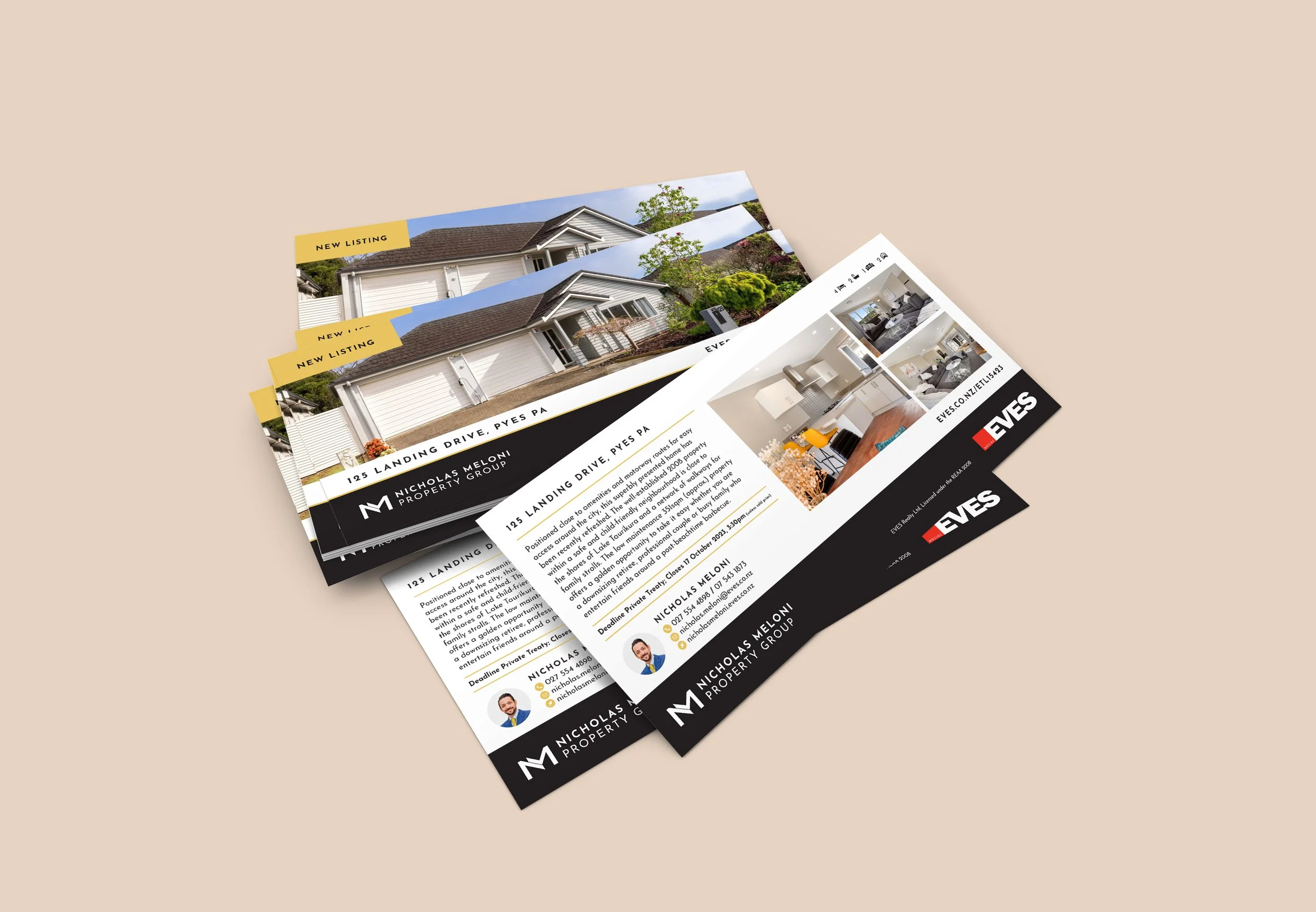
I spent four years working as Brand Manager and Graphic Designer for Nicholas Meloni, who was consistently ranked as the #1 agent for EVES Real Estate nationwide during this time. From leading a complete rebrand to managing social media, advertising campaigns, property templates, and branded merchandise, I played a pivotal role in establishing a standout personal brand. While working in with EVES’ dual-branding requirements, we successfully developed a look that was instantly recognisable and uniquely Nicholas.



T&M Studio
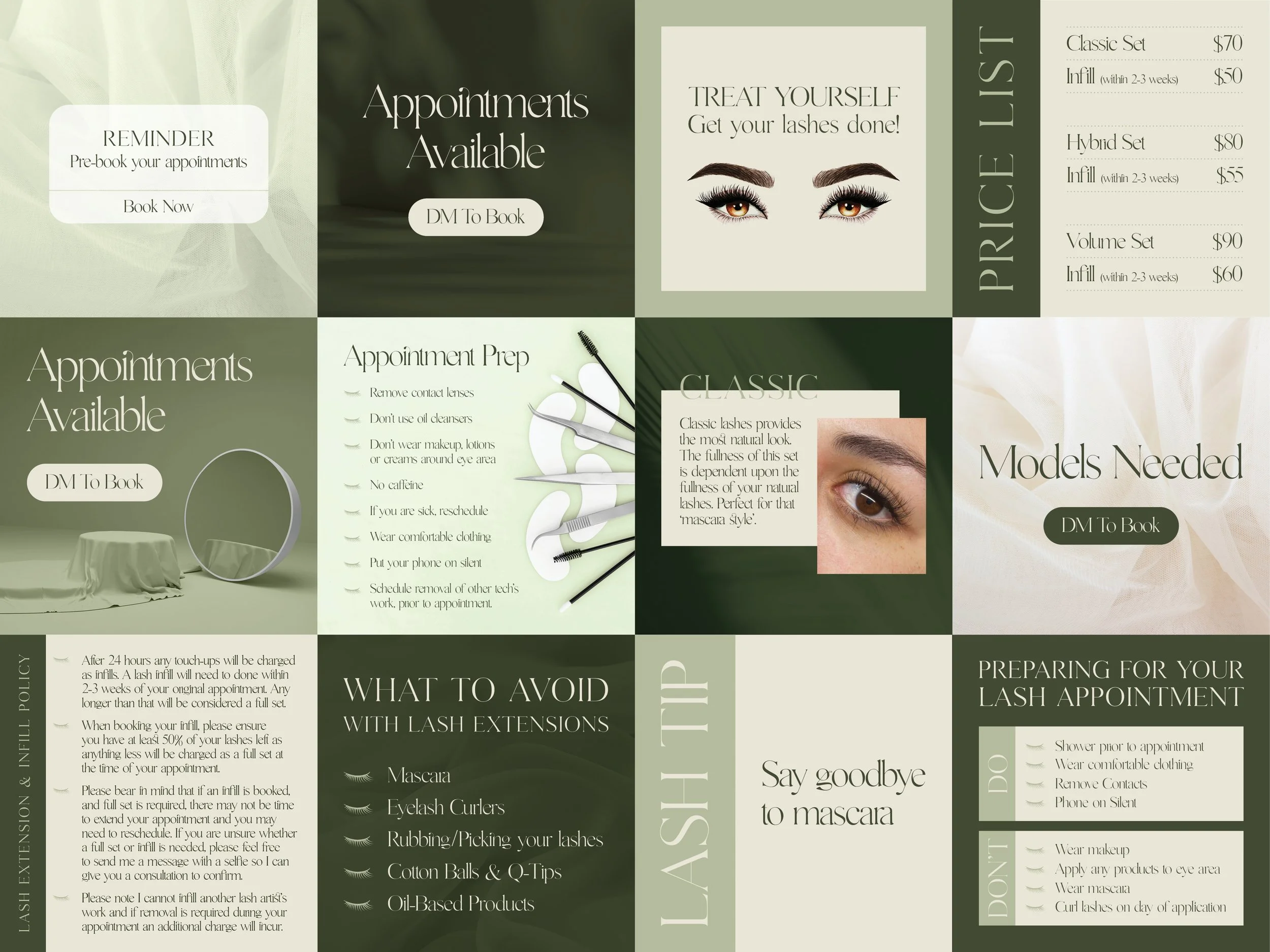
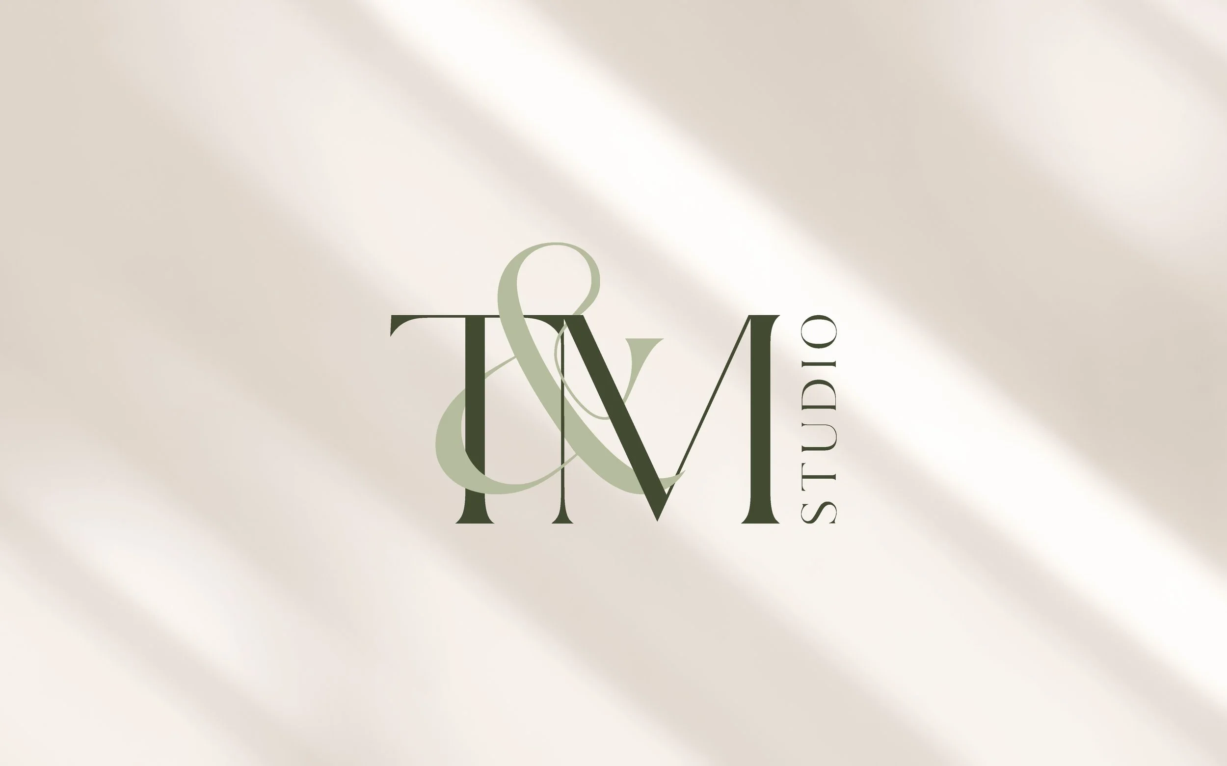
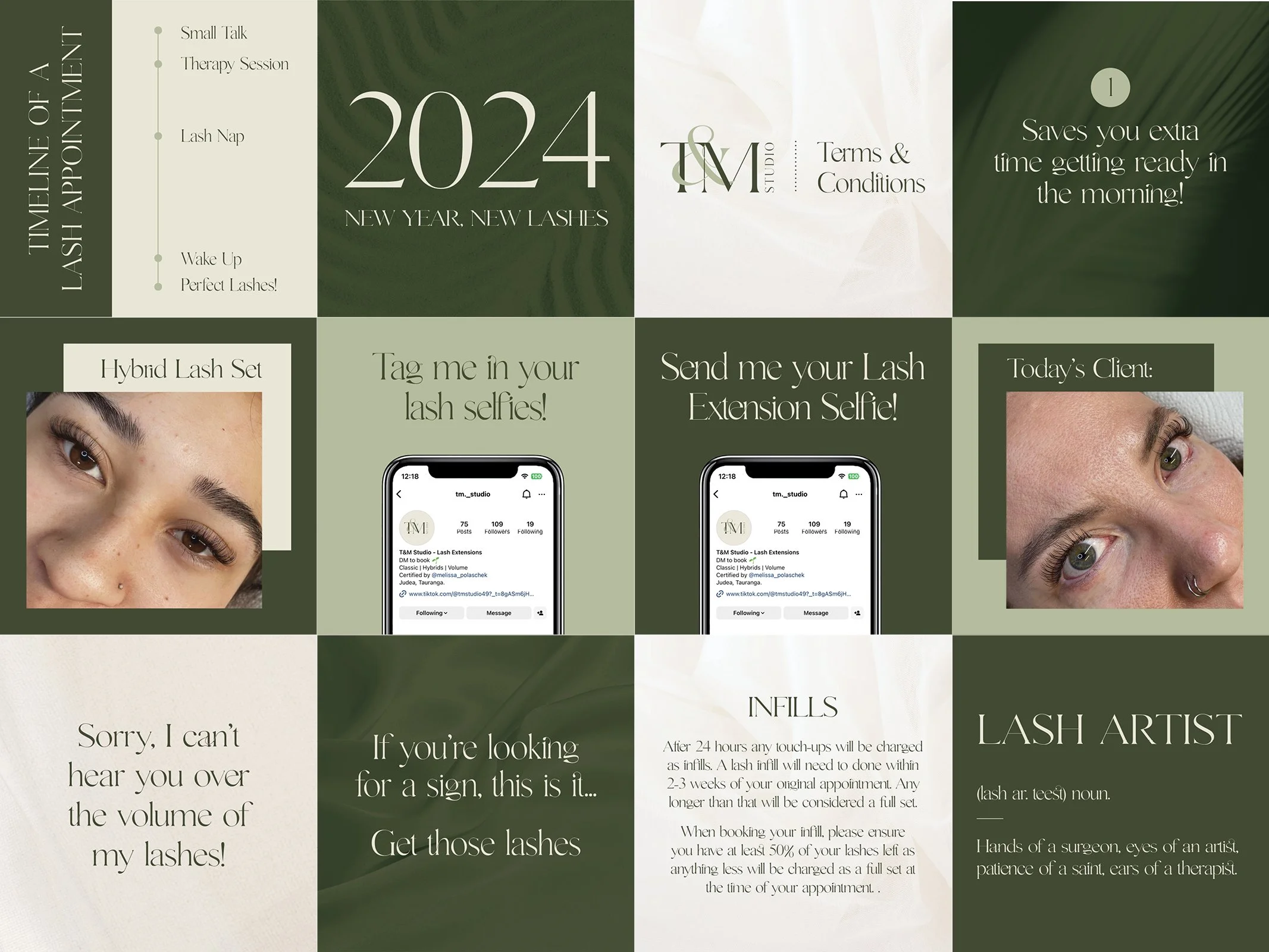
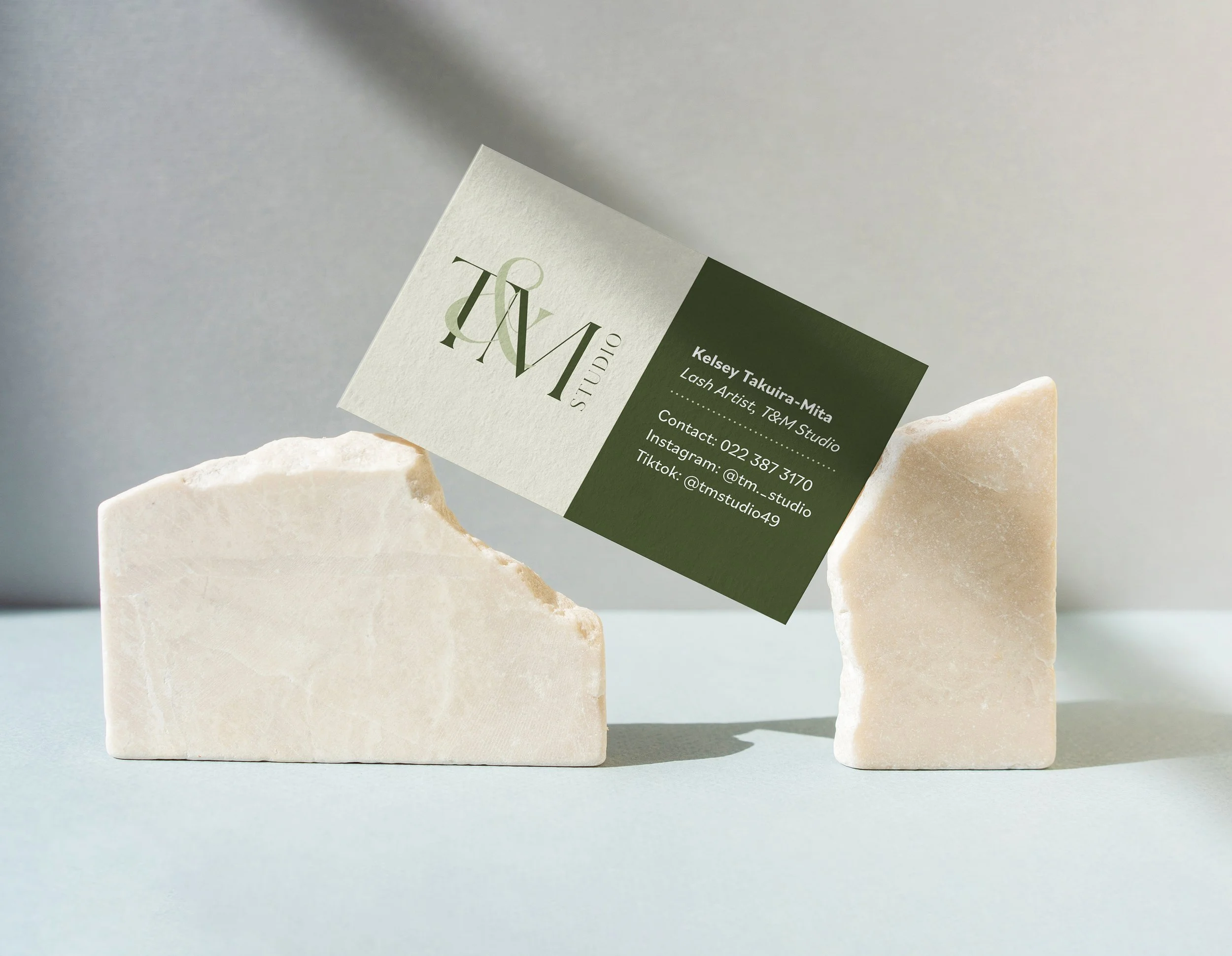
T&M Studio is a lash salon based in Tauranga. We intentionally avoided cliché design elements like lashes or beauty tools in the branding, keeping the look clean and versatile to support future expansion into other areas of beauty. Soft neutral shades paired with natural green tones create a relaxed, spa-like feel, complemented by an elegant typeface that adds a refined touch.



Maison des Intérieurs
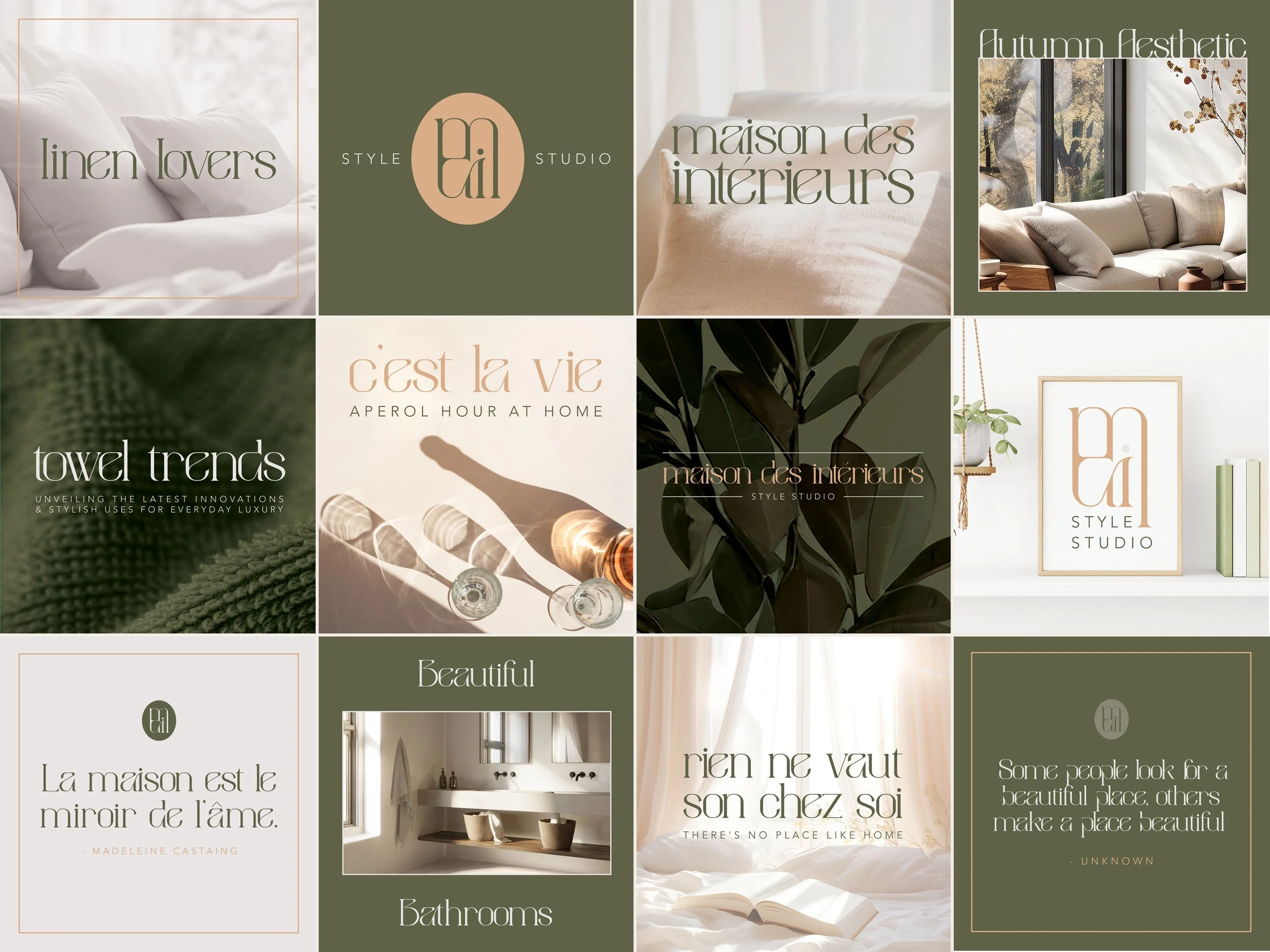
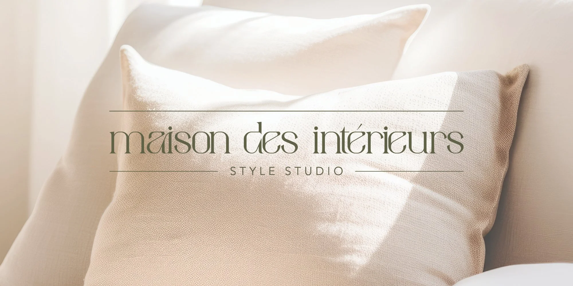
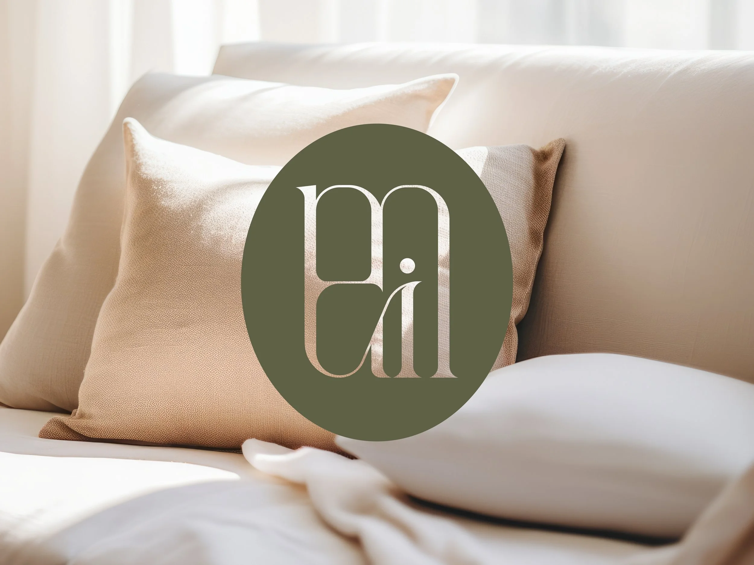
I designed the branding for Maison des Intérieurs, a luxury interior design studio and blog. The brief was to reflect the brand’s refined and elegant aesthetic. The logo is minimalist yet luxurious, featuring elegant typography to create a unqiue brand icon and a suite of full logo variations. The colour palette uses rich, autumnal tones paired with soft neutrals to reflect a sense of warmth, depth, and understated opulence.



Ross Clayton
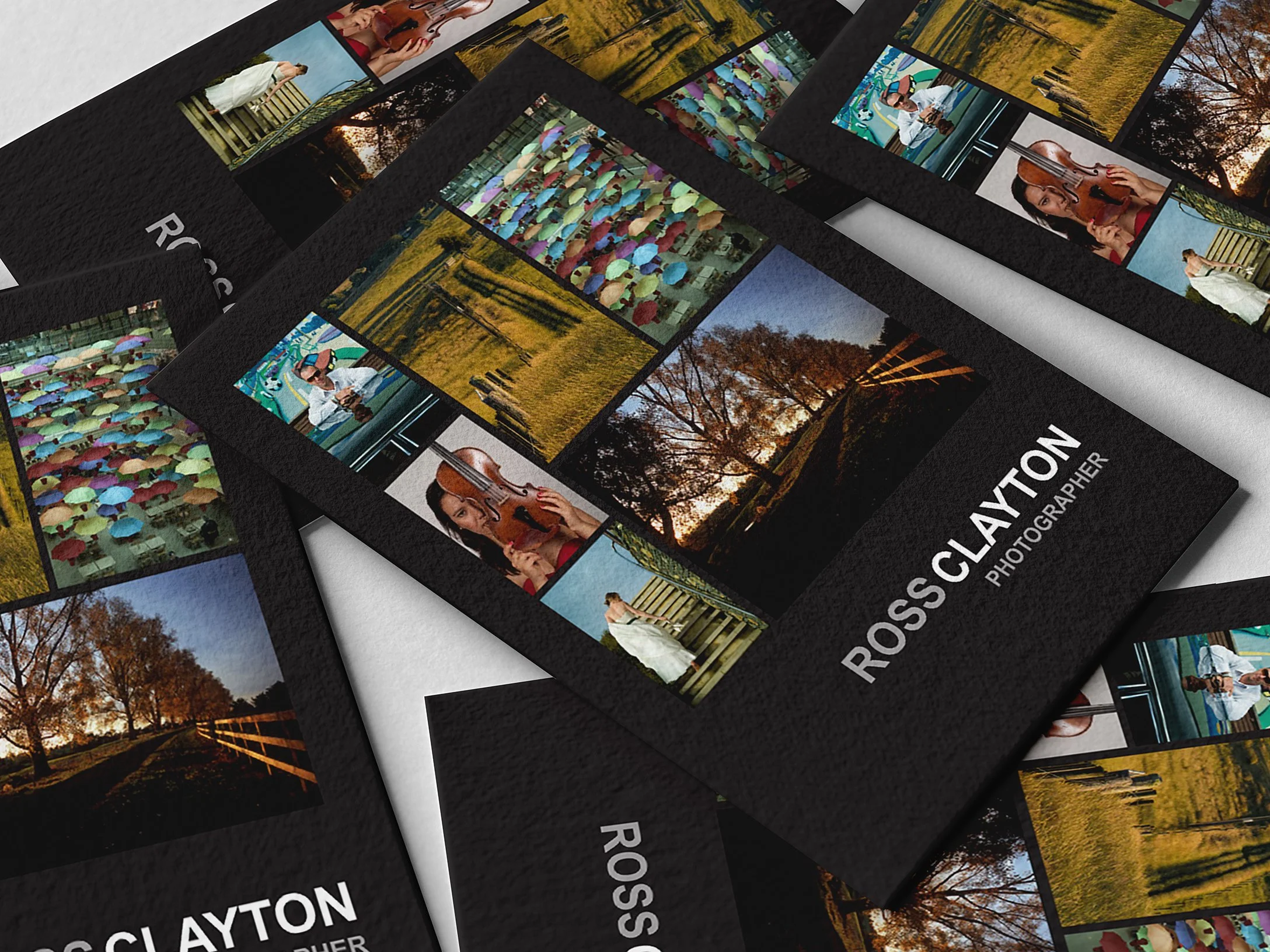
I spent three years working alongside Ross Clayton as his Graphic Designer, playing a key role in rebranding his business with a modern, minimalistic identity that allowed his imagery to take centre stage. This involved a complete redesign—starting with the logo and extending to business cards, price lists, and flyers. I created a consistent and recognisable brand presence for Ross, with cohesive design and typography applied across all collateral.



Simply Sweet Treats
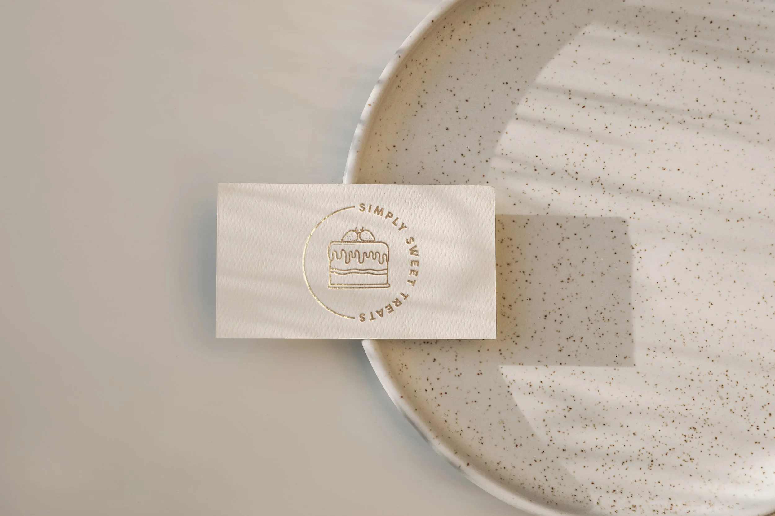
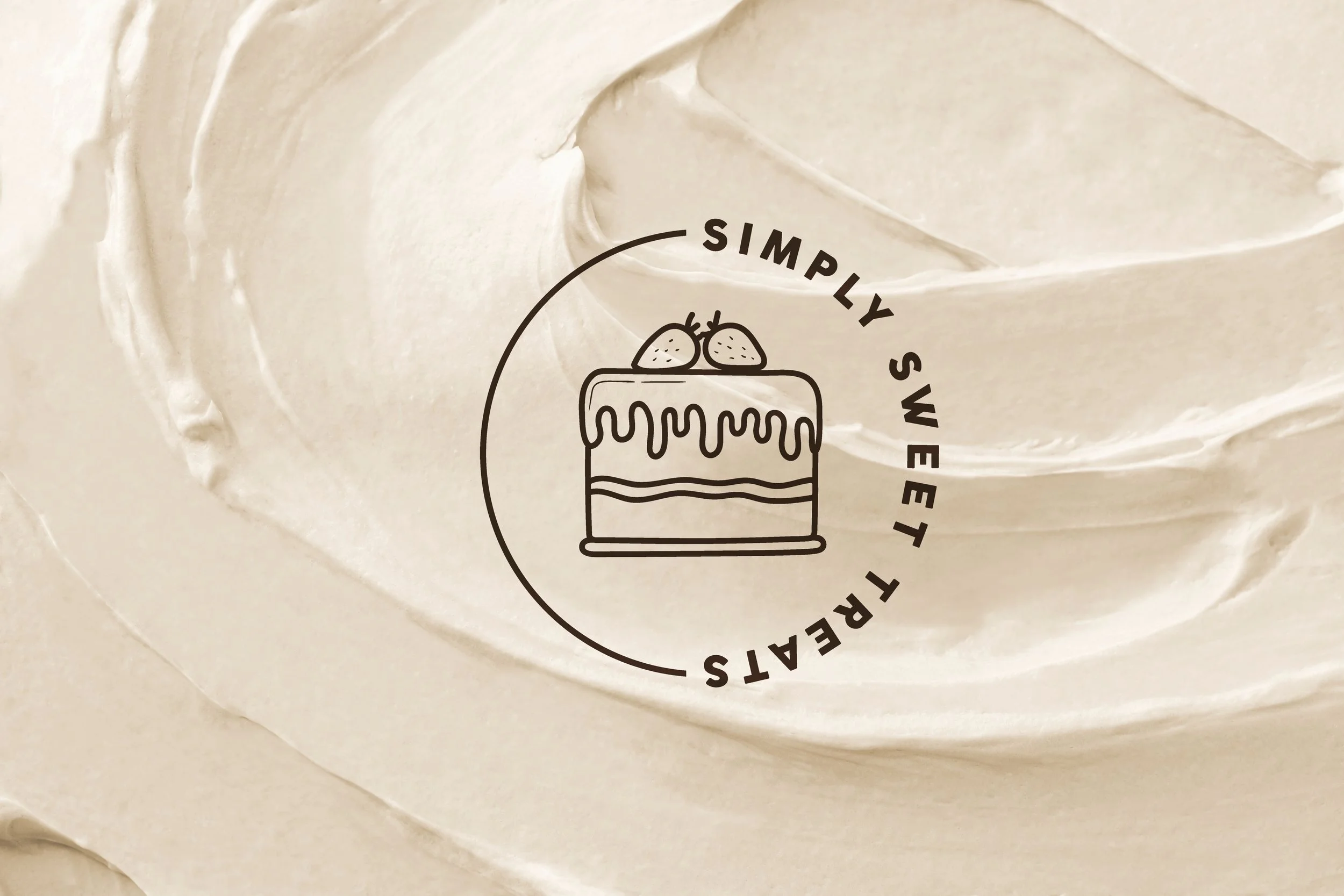
I designed the branding and packaging for Simply Sweet Treats, a bespoke cake and dessert company. The logo features a soft but bold sans serif font paired with a hand-drawn cake illustration that’s carried across the brand. I explored different text treatments, such as circular type and rotated fonts, and varied the layout across collateral, while keeping the overall look cohesive. Taglines and simple illustrations enhance the visual appeal, with a soft, neutral palette that complements the branding and ties in with the baking theme.


Lisa Westerby
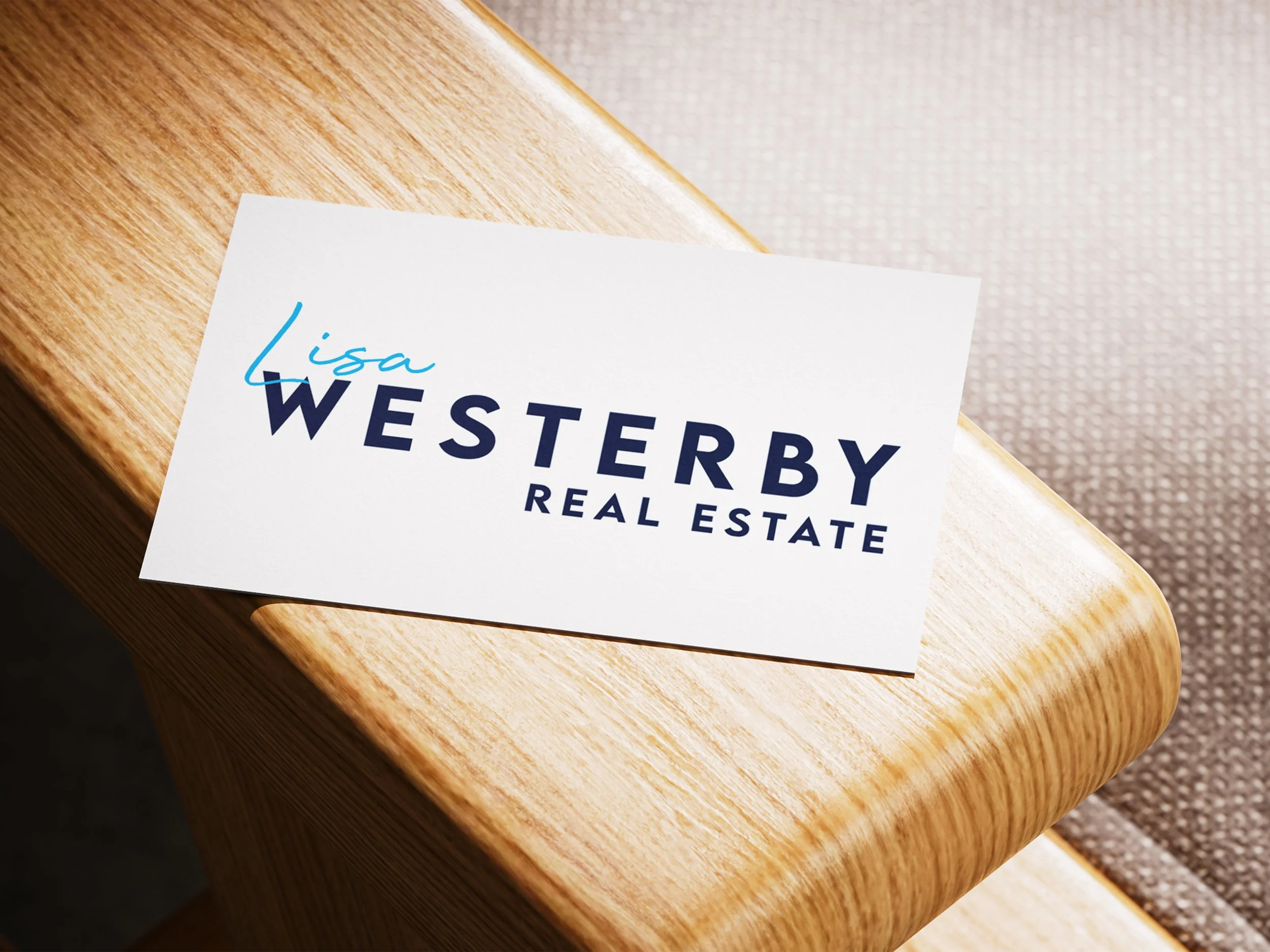
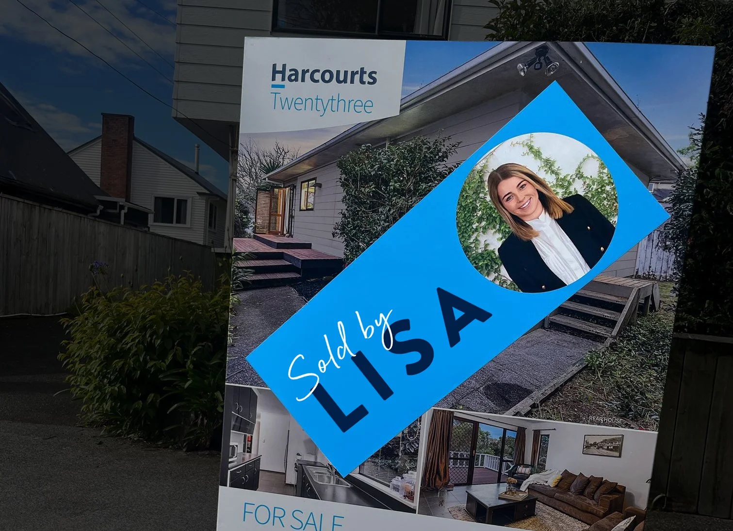
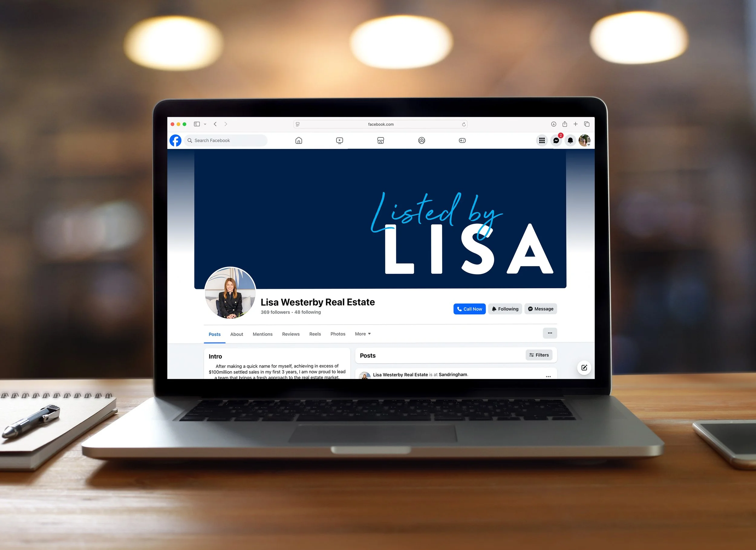
A series of lockups created for Lisa Westerby, one of Harcourts Northern Region’s top agents. Using Harcourts’ colours and fonts, these designs reflect her personal brand with a name logo accompanied by her taglines, “Listed by Lisa” and “Sold by Lisa.”
The Source
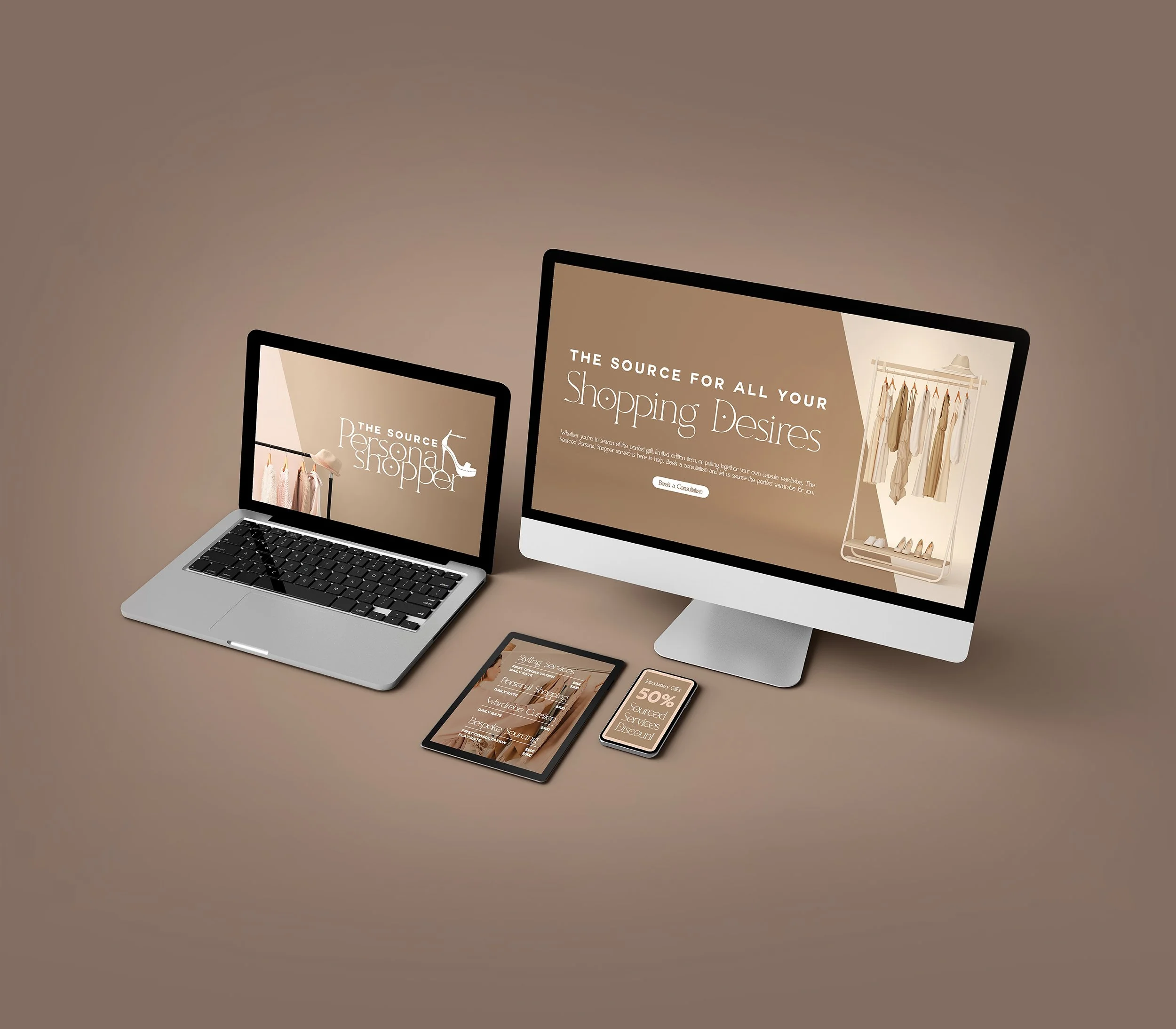
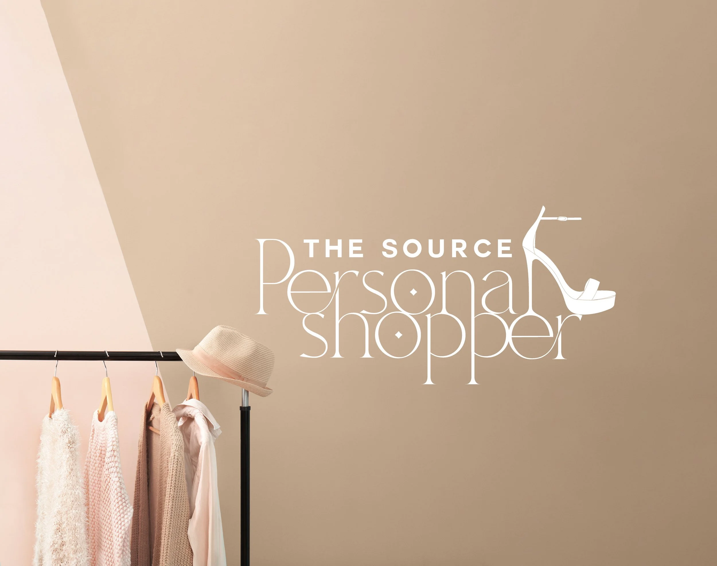
The branding for The Source Personal Shopper had to portray a sense of style and sophistication. With a modern and chic logo, stylish imagery, and a soft color scheme of beige, tan, and pink, the brand design reflects their expertise in personal styling and wardrobe curation.

B-Buckle
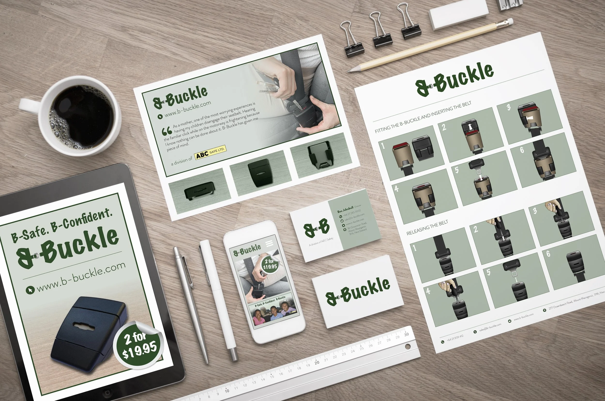
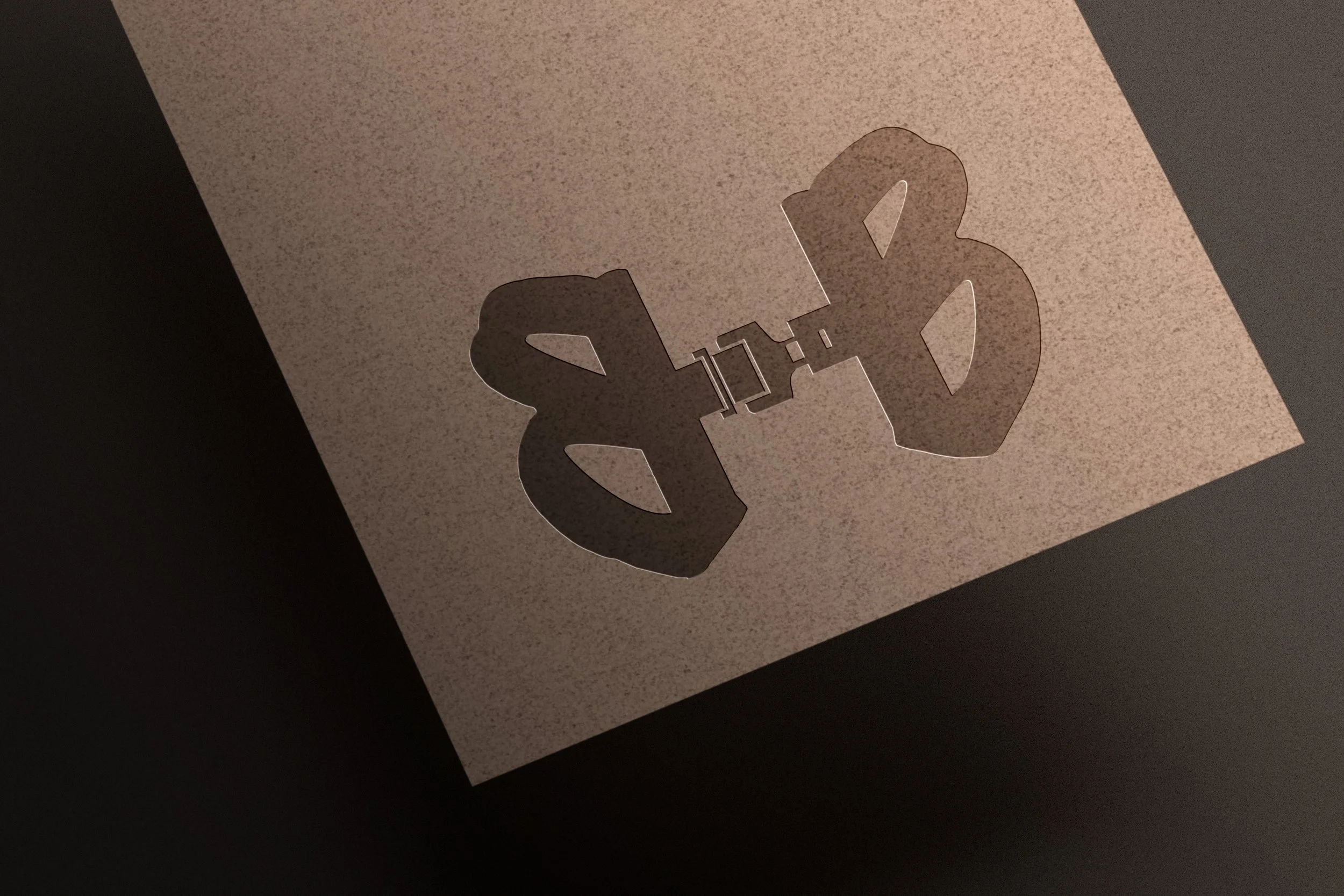
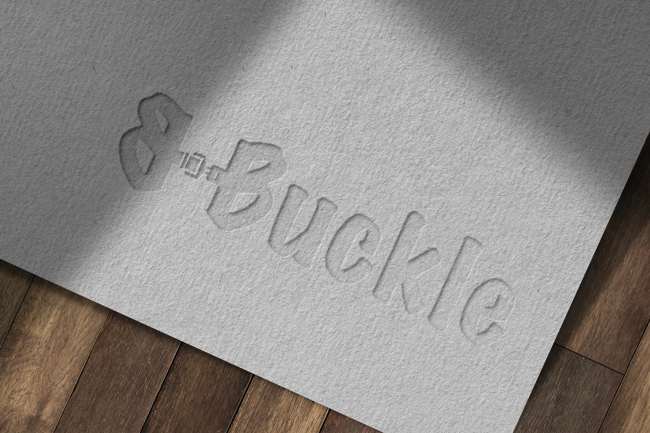
B-Buckle’s branding was created to highlight safety and connect with its main audience, parents of young children and people with disabilities. I designed a logo that includes a buckle in the double “B,” to clearly link the brand to seatbelt safety. I also used hand-drawn illustrations to show safe habits in a friendly, personal way. The main font has a playful, child-friendly feel to appeal to parents, but it’s still clean and easy to read for everyone.
Ash Artistry
I designed the branding for Ash Artistry, an events-focused makeup artist. This included everything from the logo to a complete brand package. The aesthetic reflects neutral makeup tones, professional photography, and curated imagery, all crafted to convey a luxurious and elevated feel. The suite of work included a logo that avoided any industry clichés, along with a website, service pricelist, and an interactive consultation booking form. I loved working with the fun typography that works with the brand’s polished look.


